Introduction
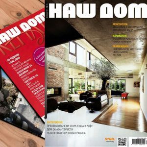
Radoslav Savov is making his debut in the oldest Bulgarian magazine for interior design and architecture Nash Dom (“Our Home”) with the interior of his own house in London. This is a great opportunity for him to present both his architectural and design skills.
Growing up among arts and crafts, studying in the School of Applied Arts and then graphic design, Radoslav is now part of the team of the company Braerise UK (LTD), specializing in construction, design, and maintenance.
“I’ve always had a dream to create the home for me and my family, but I think I invested much more than wood, concrete and glass. All those years growing up among different types of art – paintings, sculptures, woodcarving, through my trips and travels to different countries and the contact with different cultures, even my passion for cooking, all this now reflects in the interior, comfort and spirit of the house we call home.”, Radoslav Savov said.
Transformation
Putting together an old English house with a young man’s dream to design his ideal home has had a happy outcome. Radoslav Savov succeeded in transforming the old building into a spiritual, functional, modern place where every detail is carefully planned and implemented.

“I have always wanted my home to have varied design, hidden and built-in furniture, moving panels, doors up to the ceiling, industrial elements, which to showcase the structure, an interesting staircase, natural materials,” says the creator and implements this idea in his house. All the furniture and elements are specifically designed for this place and made on site. The small house turned into a spacious and comfortable place with all the amenities needed by a family of four.
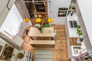
- Since the kitchen space is limited, the roof line is left visible, which extends visually the volume and provides a lot of breathing space. The height from floor to the highest point of the ceiling is about 16 feet.
- The line of the kitchen cabinets is clear and they have no handles, which facilitates the use and maintenance. The kitchen is brought 4 inches forward, which provides additional width for the countertop to compensate for its length. The upper row of cabinets is also brought forward and there’s built-in led lights behind it. The electricity sockets are not placed on the glass back, but under the cabinets, which makes for a clear line. The central high cabinets are made on site, in order to use optimally the height and follow the slanted roof line. All doors can be opened, and the longest one is almost 10 feet. The access to the upper floor is provided by a ladder.

1, 4. The area with the sofa bed from IKEA is assimilated successfully, thanks to the line of the stairs without handrails and the small bend between the two windows. The sofa was 4 inches longer but it was easily transformed to fit. The warmth of the walnut veneer creates a different atmosphere in this zone. The floor in the kitchen, living room, hallway and part of the bathroom is the original pine flooring, carefully re-laid and refinished.
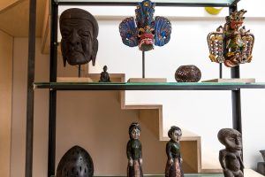
- On the very day of the survey, the vision of the glass shelf was born. It connects the two levels and is one of the highlights in the dwelling.
- The staircase itself is very interesting. It is constructed of 1 inch thick plywood, and despite the thin material its strength is outstanding, thanks to a special gunwale.
- The glass shelf also serves as a railing on the stairs up to the loft.
- The concept for the wall above the sofa and the stairs is to be filled with different pictures of trips, gifts and memorabilia. A piece of newspaper from 1937 found in the floor during repairs has been framed and put there.
3, 4. The guest room on the second floor is designed plainly. One of the highlights is an open wardrobe, which was made on-site too. This room has an access to the roof terrace.
5, 6. The master bathroom is another key element in the design of the apartment and is located on the main ground level. It was created in a way that it feels like part of the common area and for that reason the floor of the kitchen was extended within the living room, hallway and bathroom. A sliding glass door was installed, which, when open, creates the impression that the corridor goes on. The small patterned tiles in the bathroom are visible from the sofa.
- The stairs from the second floor to the loft.
2, 3, 4. The master bedroom in the loft. An interesting solution here is the toilet hidden behind panels so it looks like a wardrobe – small but very practical. There is a mosaic and several built-in cupboards for more convenience. Two of the walls are painted and the third is decorated in the same color as the rest of the interior.
5, 6, 7. The exterior of the house is typically English with the brick facade of the house. The original front gate of the house has been retained and carefully restored. The style of the garden is modern. A tall bamboo is planted, which naturally divides the garden into two areas. The additional building contains all the boilers and other necessary systems for hot water and heating.


