CLINK STREET
This project was one of the most special because the architect Sue Minter had given us the task of coordinating and following every step, both from full implementation and from the supply of all the materials and fittings, as well as the whole management. The apartment is located in one of the busiest places in London, namely the notorious market Borough Market (London Bridge).
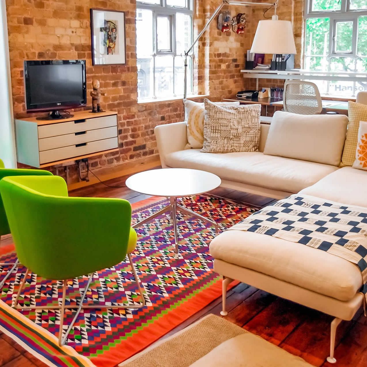
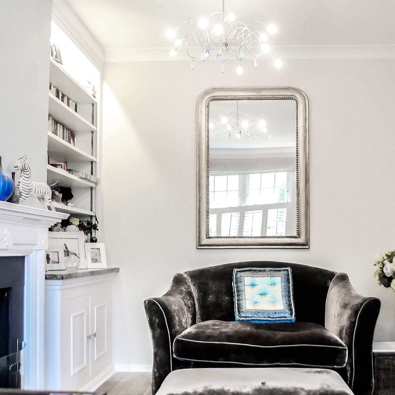
The building itself was rebuilt about 15 years ago, allowing us all the partitions to be demolished and only the outer solid brick walls and floors left. The only other thing that was preserved and carefully covered was the numerous bookshelves filled with many books (the interesting fact is that the client has read all of them) and continues to add new ones.
The main idea behind the new layout of the new premises was to maintain approximately the same configuration as before and to optimally use each small corner and place. Here Sue Minter showed extraordinary professionalism and managed to really get into the life of the owner and create this masterpiece.
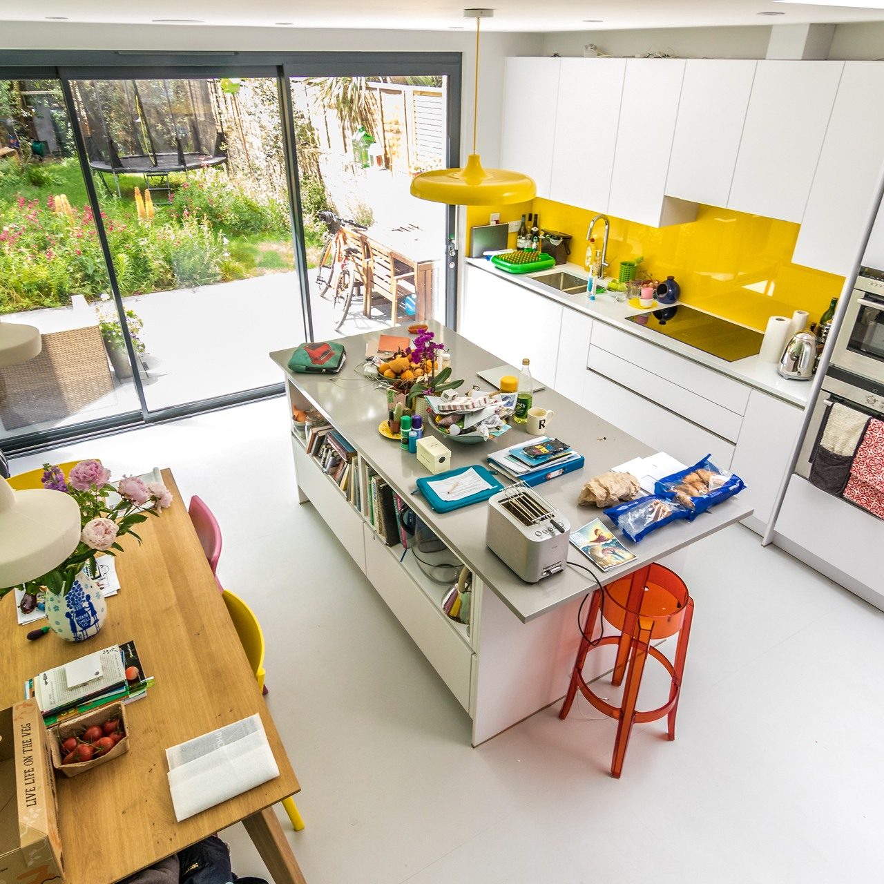
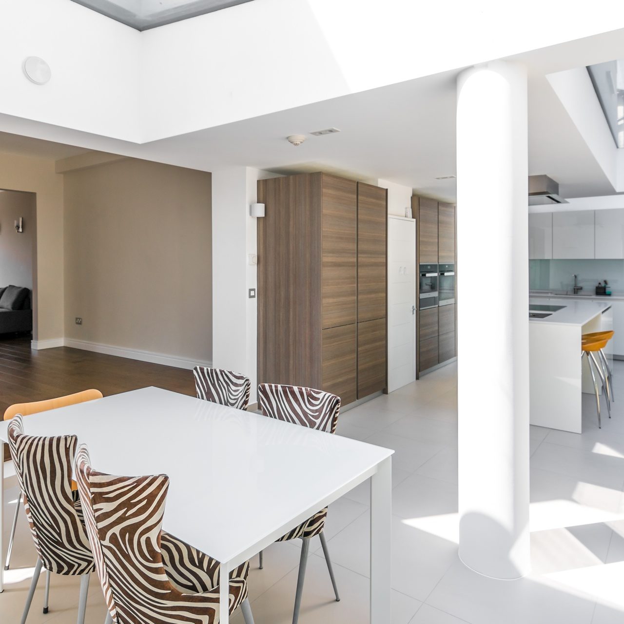
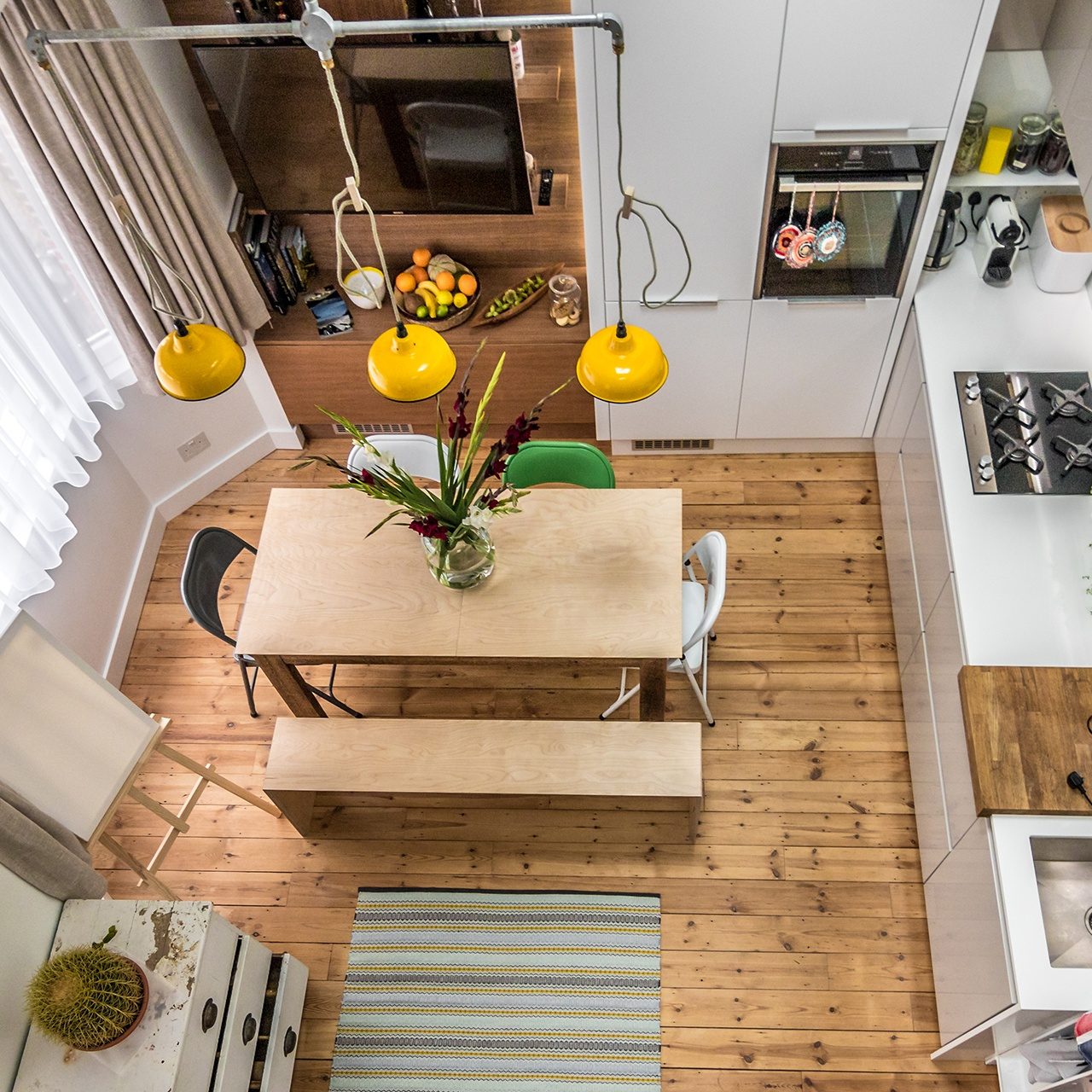
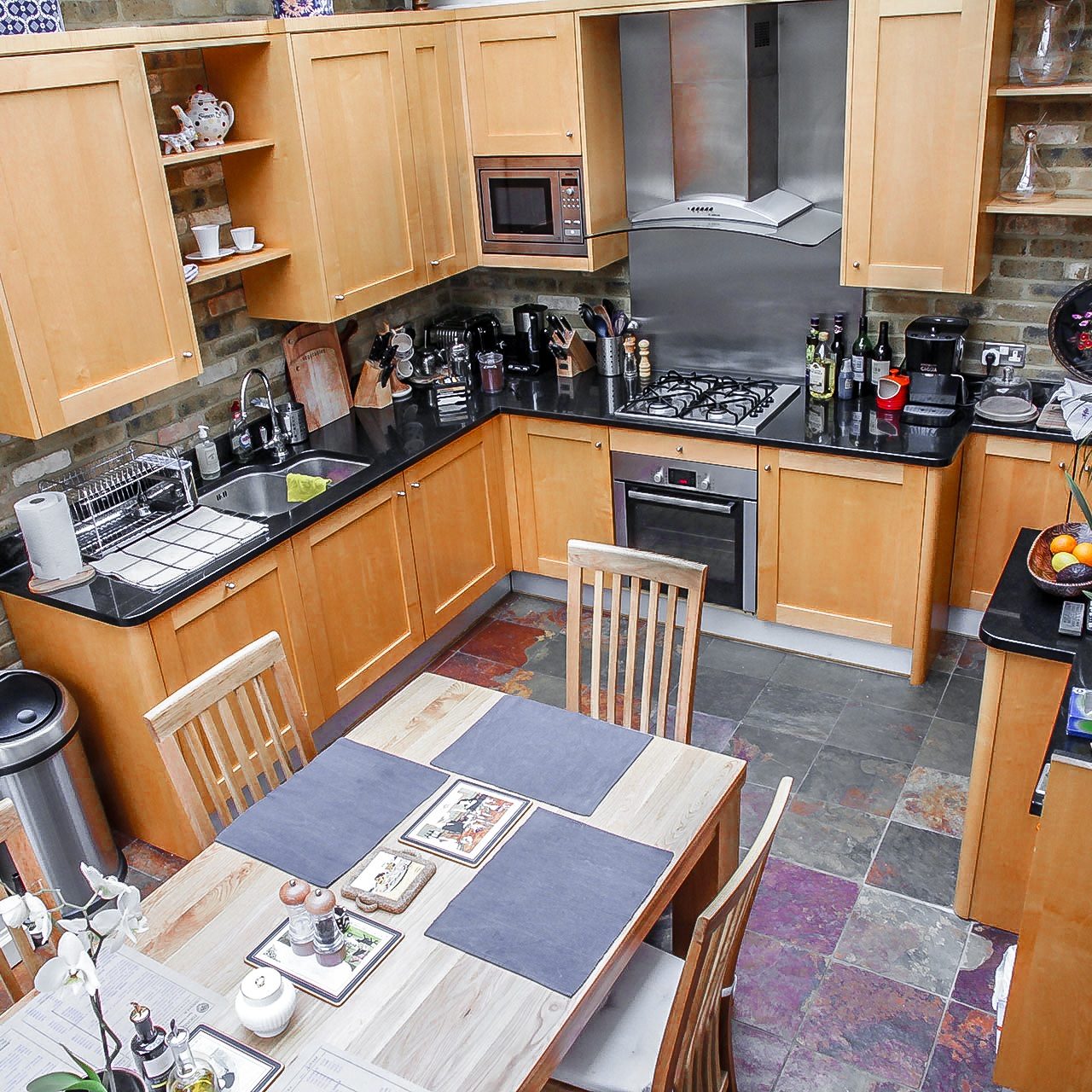
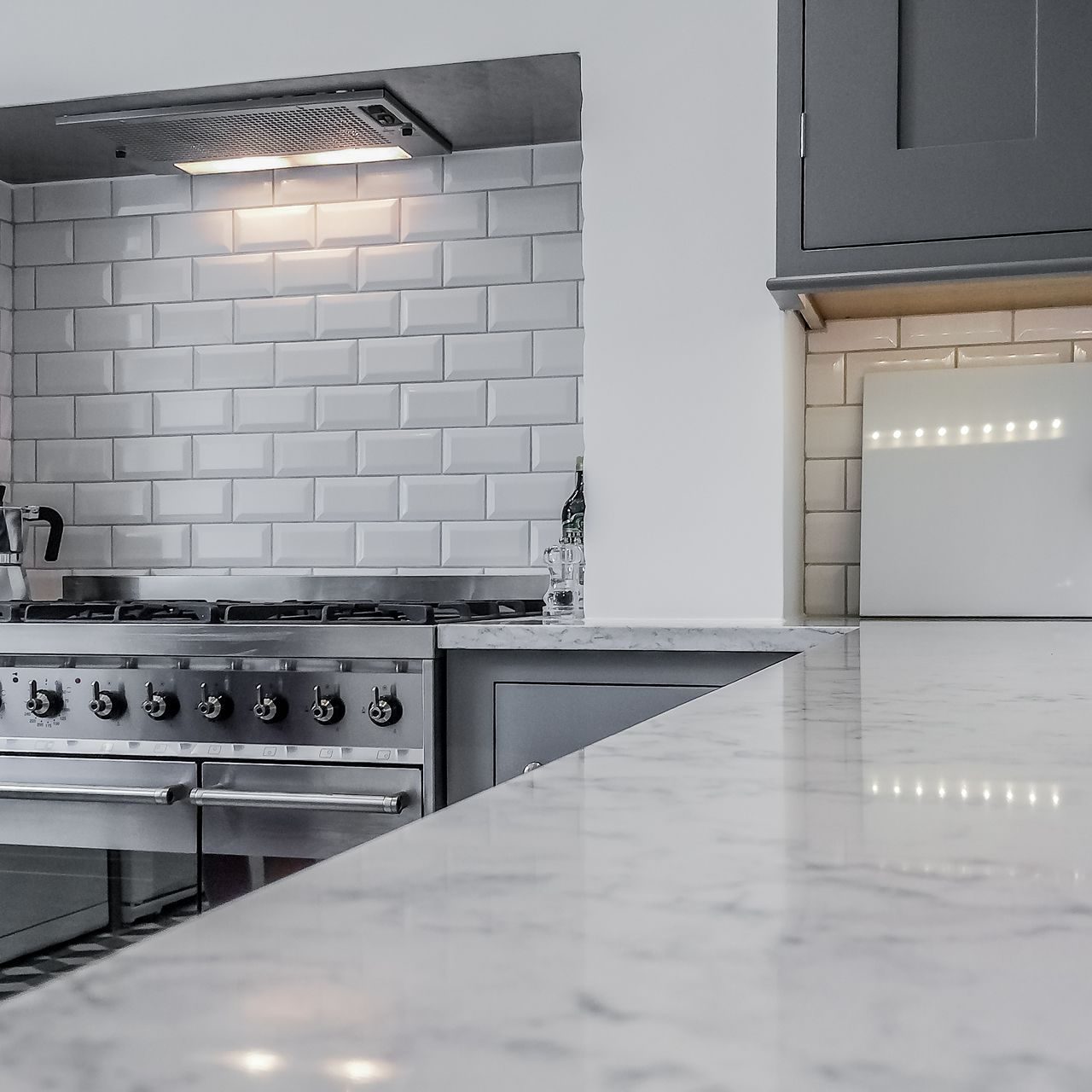
The kitchen is quite unusual in that the island and the cabinets themselves are very interesting in relation to other walls and rooms. Every detail is extremely special – the colour range, the texture of the materials, the use of a real wood to make a small bench on one side of the kitchen island, and the discreet doors (hidden doors) leading to the utility room.
To the left hand side of the kitchen is the guest room as well as the bathroom to it. An enormous sliding glass door was installed to enter the room. In an open position, it gets behind the built-in wooden bedroom. The apartment is divided into 3 different heights and the floors have a different number of stairs in the different rooms.
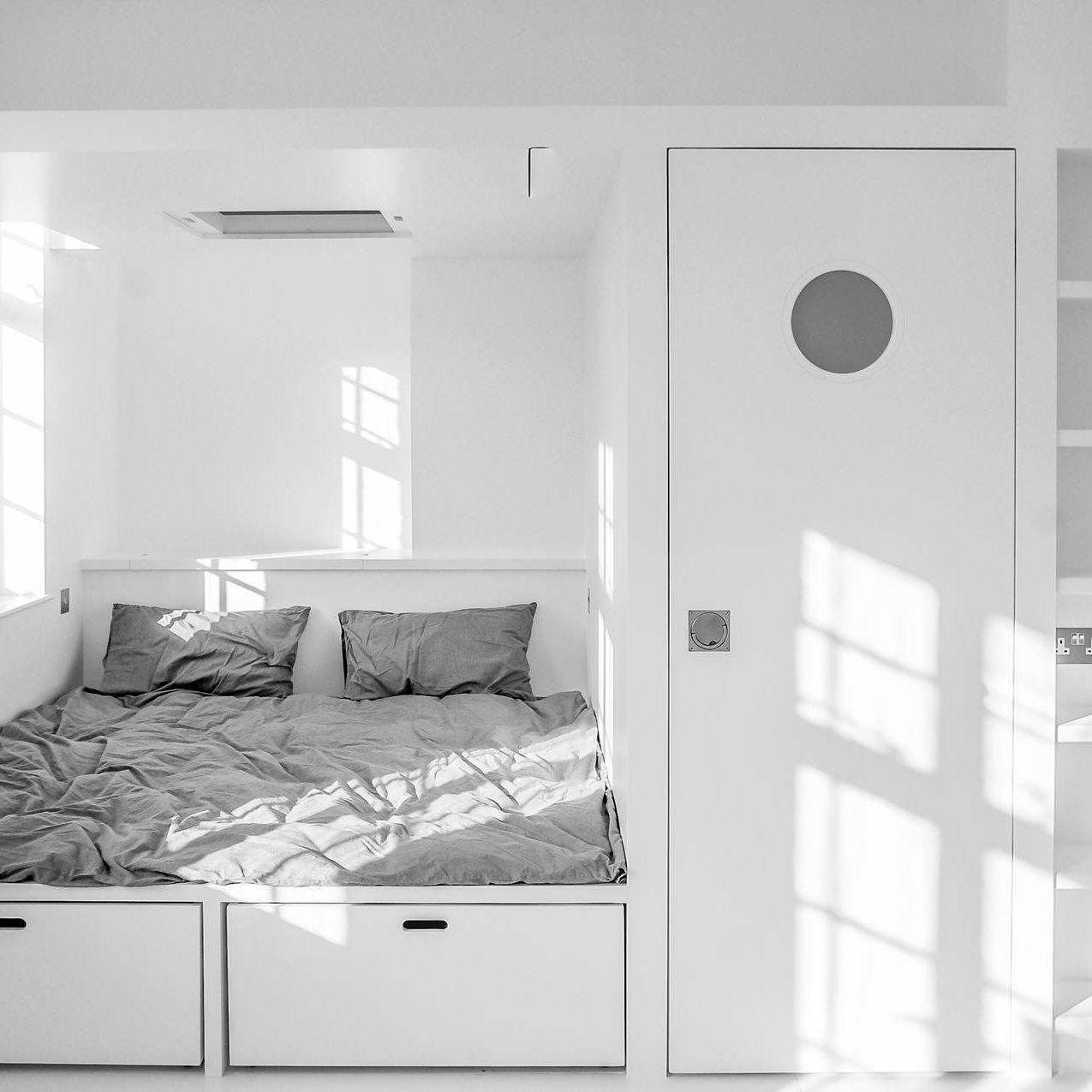
The bedroom may be what makes the whole project shine and make an extraordinary difference. The premises are with 3.6 meters height and this allowed to be divided into two levels. There are stairs that lead you to the bedroom itself, where you can sit comfortably and it is extremely spacious. A warehouse (wardrobe type), which is used for a winery, was formed at the lower level. Each niche is so used that all constructs connect like a big Tetris.
The material used to make the beds, stairs and all other structures in the rooms is Austrian plywood, which is cut so that the stripes of the various planks together can be seen. Extremely interesting and rarely used material.
Bathrooms are extremely light and stylish. The interesting thing about one of them is that the cabinet under the sink is made of walnut massif and it is again designed specifically for the project.
